Photo book review choose the best of 3
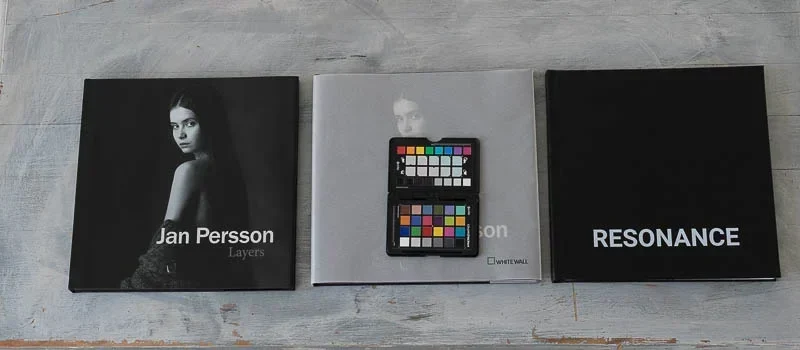
Blurb Whitewall SAAL photo book review, a detailed photo book review by a professional photographer. Why print a photo book? With all the options of
Blurb Whitewall SAAL photo book review, a detailed photo book review by a professional photographer. Why print a photo book? With all the options of

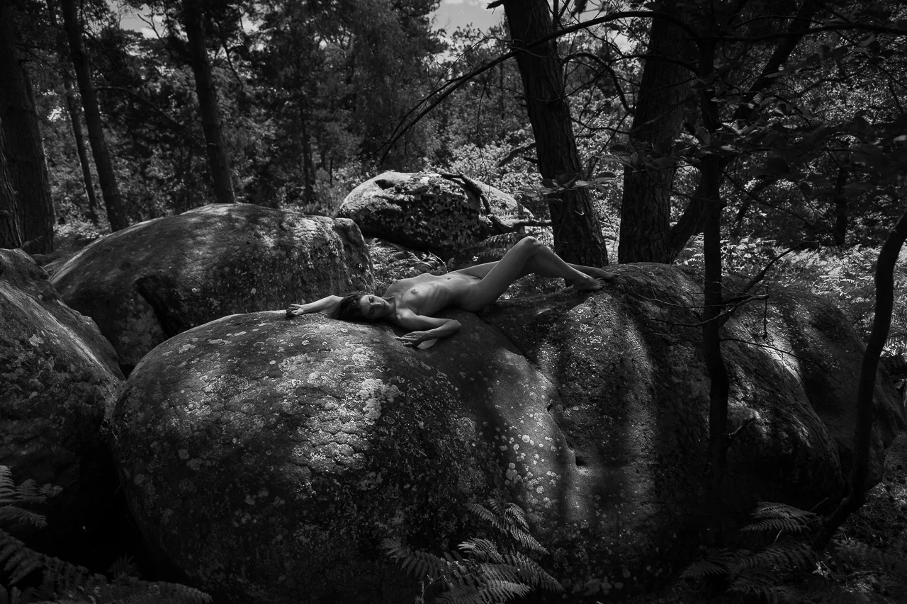
Photographie Workshop Portrait Nu avec Laura BGN par Neil Snape Ce workshop est désormais complet. Dimanche 16 mai 14h-19h à Paris Date : dimanche 16 mai 2021
BenQ SW271C 4K 27″ monitor review Introduction BenQ SW271C is an updated version of a UHD 4K 3840×2160 pixel 27” monitor that offers the latest

Art Photography Workshop Kaluuna Moon par Neil Snape Dimanche le 14 février 12h-17h à Paris Date : dimanche 14 février 2021 Horaires : de 12h à 17h
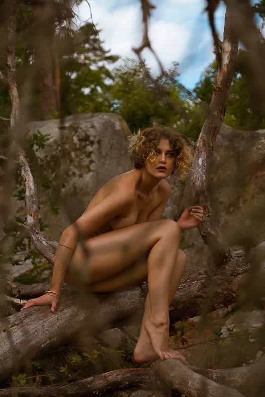
Art Nu Workshop Andréa Lebris par Neil Snape Dimanche le 25 octobre 13h-18h à Paris Date : dimanche 25 octobre 2020 Horaires : de 13h à 18h

Art Nu Workshop Kaluuna Moon
Ce workshop est désormais complet. Workshop Spécial beauté naturelle par Neil Snape Paris Workshop spécial beauté naturelle, portrait et nu artistique avec Marine samedi 26

BenQ Webinar mastering color edits in 5 ways Free registration open to everyone. Join us! BenQ Webinar mastering color edits for model, beauty, and portrait
Ce workshop est désormais complet. Fontainebleau Workshop Rebecca Bagnol et Andréa Lebris par Neil Snape Le jeudi 9 juillet 10h-17h à Fontainebleau Date : jeudi 9 juillet
Fontainebleau Workshop Kaluuna Moon par Neil Snape Ce workshop est désormais complet. Samedi le 13 juin 10h-17h à Fontainebleau Date : samedi 13 juin 2020 Horaires :

What is an HP Designjet Z9 Plus ? After a year sitting idle more disappointments (click here) The HP Designjet Z9 Plus DR is a
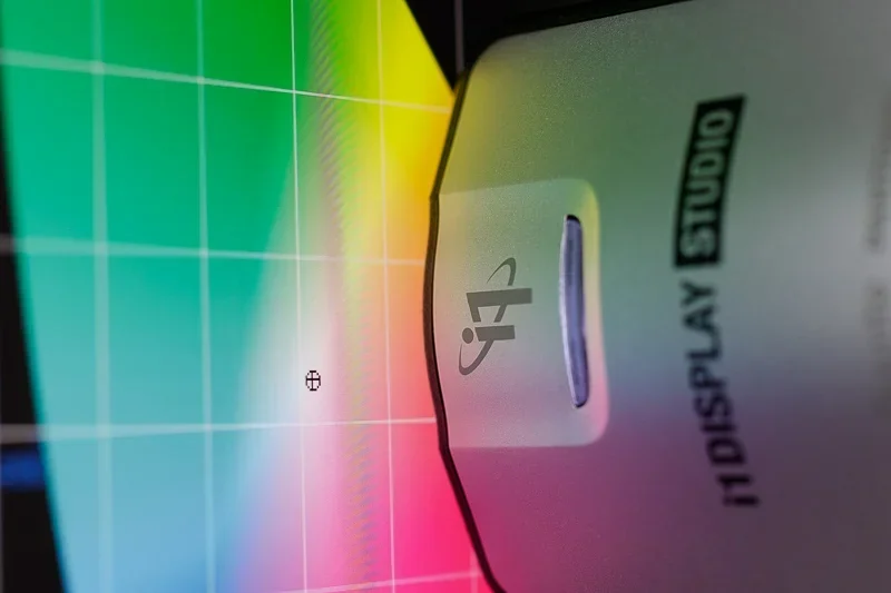
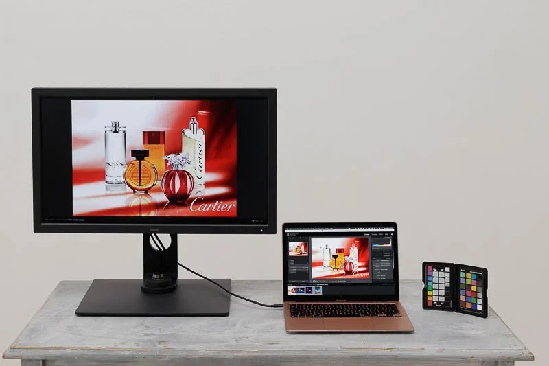
X-Rite i1 Display Studio Review Complete Display Profiling Kit Is the X-Rite i1 Display Studio the right profiling kit for you? In this X-Rite i1
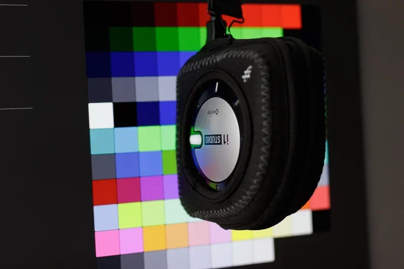
X-Rite i1 Studio Review : All in One Color Management Kit Is this X-Rite i1 Studio review on all in one color management for you?

BenQ SW321C monitor review Introduction BenQ SW321C is a newly updated version of a UHD 4K 32” monitor that offers modern connectivity, superb matte surface
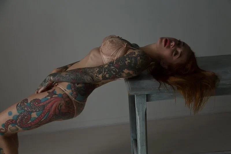
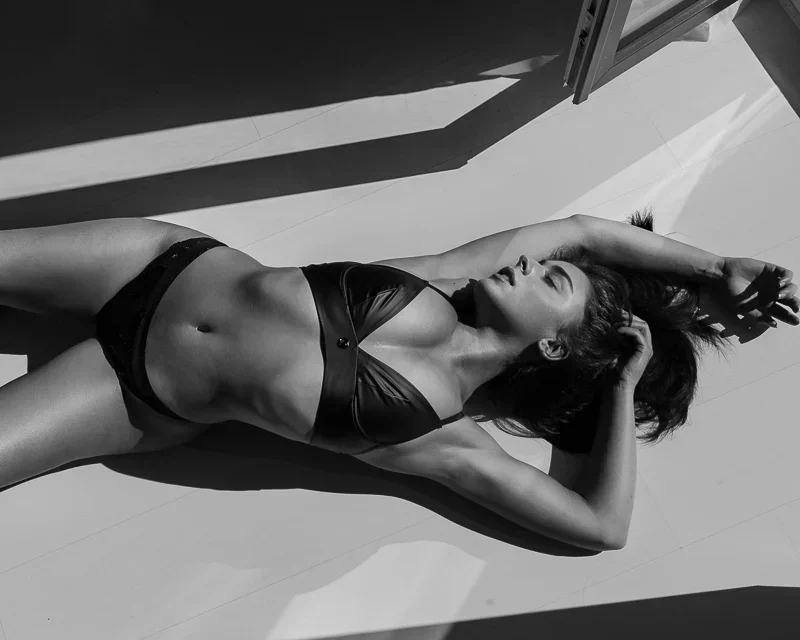
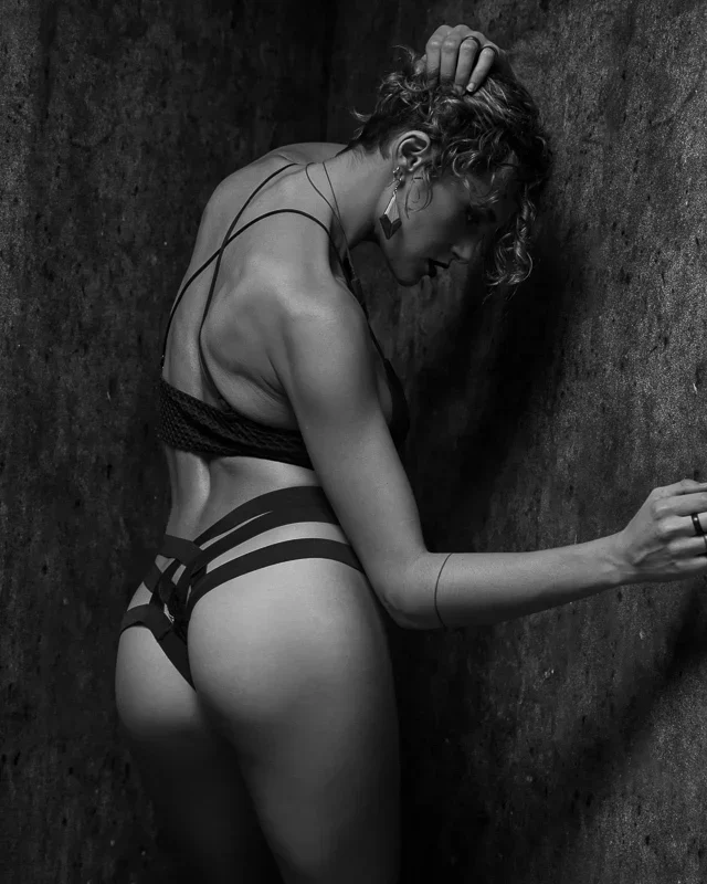
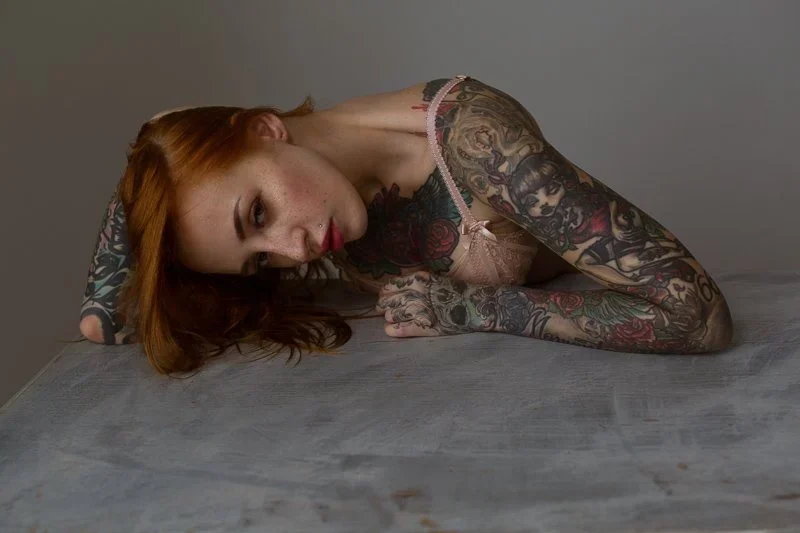
Ce workshop est désormais complet. Workshop Beauty Portraits Inked Nu Paris avec Yana Sinner Workshop Beauty Portraits Inked Nu Paris avec Yana Sinner dimanche 8
Workshop sold out, thanks for your interest. Glamour Portrait Beauty workshop with Yana Sinner in Paris by Neil Snape Glamour Portrait Beauty workshop with Yana
Marilyn to Newton Workshop with Devushcat in Paris by Neil Snape Marilyn to Newton Workshop with Devushcat by Neil Snape Saturday 22nd February 2020 Date : Saturday 22nd

Workshop Lingerie Paris Devushcat par Neil Snape Workshop Lingerie Paris Devushcat et Nu Artistique samedi 22 février Dates : samedi 22 février Horaires : de

This workshop is sold out, more coming, Devushcat 22 Febraury and Yana Sinner 8 March. Portrait Lingerie Workshop & Nude with Miluniel in Paris Portrait

Ce workshop est désormais complet. Paris Workshop Lingerie Miluniel par Neil Snape Paris Workshop Lingerie et Nu Artistique avec Miluniel dimanche 26 janvier 12h-17h à